Think about the last time you opened Instagram and got hit with a feed full of Barbie-pink outfits. Did you feel weirdly… cheerful? Or maybe you walked into a friend’s apartment painted sage green and instantly felt like you should light a candle, journal, and re-think your life choices. Coincidence? Not really.
Color isn’t just something we wear or paint on walls. It’s a mood-altering, heart-rate-shifting, sometimes even appetite-changing force. Marketers know it, designers play with it, and your favorite influencer has 100% built their aesthetic on it, whether consciously or not.
Scientists have been quietly studying the effect of color on the human brain for decades, but the rest of us are only just catching up. What’s fascinating is how our collective culture keeps “rediscovering” the power of color: from the muted beige baby aesthetic that parents now fight about online, to neon Y2K nostalgia that screams optimism with a side of chaos.
So yes, that pastel manicure, that emerald green dress, that carefully chosen beige couch – they’re all doing a little more than just looking pretty. They’re quietly working on your nervous system, your emotions, and even your bank account.
The Science of Seeing Color
Your Brain on Color
First, a little science (promise this won’t hurt a bit). Color is basically light waves decoded and translated by the brain. Different wavelengths of light hit the receptors in your eyes, creating unique signals which are sent to the brain. Then, your brain interprets them in order to decide: “That’s red. That’s blue. That’s the exact shade of purple you can never find the name for at the paint store.”
But, and this is important, your brain doesn’t just see color, it feels it. That’s why red can raise your heart rate, blue can make you breathe easier, and yellow can either perk you up or send you running from the room if there’s too much of it.
The Psychology Part (AKA Why Fast Food Chains Love Red and Yellow)
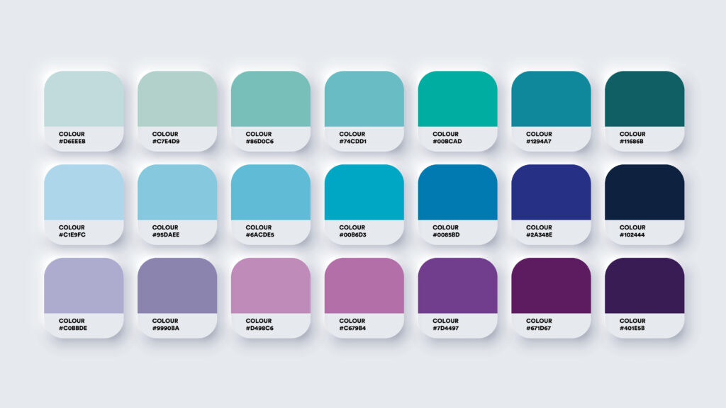
Color psychology sounds like something invented by Pinterest, but it’s an actual field of study. Researchers have found that certain shades consistently nudge human emotions and behaviors. A few greatest hits?
| Color | Core Vibes | How It Shows Up | The Cultural Flex |
|---|---|---|---|
| Red | Passion, appetite, urgency, heightened alertness | Triggers fast decisions and grabs attention | Clearance sales, stop signs, Burger King’s logo |
| Blue | Trust, calm, professionalism | Feels steady, reliable, and safe | Banks, tech companies, corporate branding |
| Green | Balance, relaxation, eco-friendliness | Signals freshness and natural vibes | Grocery stores, health brands, sustainability logos |
| Yellow | Energy, friendliness, optimism (but too much = anxiety) | Pops instantly, creates cheerful energy | Fast food spots, playful branding |
| Purple | Creativity, luxury, spirituality | Feels imaginative and elevated | Beauty products, royal symbolism, high-end goods |
| Black | Power, sophistication, authority | Minimalist and timeless | Luxury fashion, tech hardware, “serious” branding |
In other words, when you painted your kitchen bright yellow thinking it would be “sunny and happy”, you might have accidentally recreated the emotional vibe of a fast-food dining area.
Culture Colors the Picture
However, the meaning of color isn’t universal. White is purity and weddings in Western cultures, but mourning and funerals in parts of Asia. Red is danger in some contexts, celebration in others. Your nervous system reacts on one level, while your culture adds its own commentary.
The Millennial Grey Phenomenon
And then there’s our old friend, grey. Specifically, “millennial grey,” that muted neutral that filled apartments and Instagram grids for the last decade. While mocked for its soullessness, it also quietly reduced overstimulation – a kind of visual stress management for people living in a new, overstimulating digital world. Turns out, your “boring” grey couch was secretly a coping mechanism.
Color and Emotion
Mood by Design
The emotional pull of color is almost sneaky. You don’t think, “I’m calm because this room is blue.” You just feel calmer. Studies show that warm colors (reds, oranges) spark energy and excitement, while cool colors (blues, greens) bring relaxation. It’s like your environment is quietly DJ-ing your nervous system.
The Therapy Palette
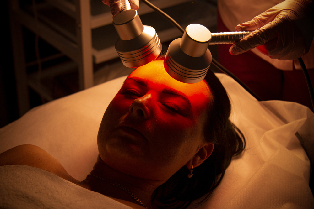
It’s not surprising, then, that color has been used in therapeutic settings. Color therapy (or chromotherapy, if you want to sound fancy) has a long, if sometimes pseudoscientific, history. But even outside fringe wellness practices, mainstream psychology borrows the concept: therapists suggest using calm, cool tones in bedrooms for sleep hygiene, or energizing hues in workspaces.
Digital wellness apps have also caught on, swapping harsh whites for softer pastels and muted backgrounds to reduce visual stress. It’s the design equivalent of a weighted blanket.
Why We Craved Pastels in Lockdown
Remember early pandemic life when “cottagecore” and soft pastels exploded in popularity? That wasn’t just escapism; it was collective mood management. When everything outside felt chaotic, people gravitated toward gentle palettes that soothed the nervous system. Color became a coping mechanism you could curate from your bedroom walls to your phone wallpaper.
A Silent Language
At the end of the day, color is an emotional shorthand. We may not consciously register that a navy suit makes us trust someone more, or that a bright kitchen feels friendlier, but our bodies keep score. Some emotional patterns are universal – red always feels urgent, blue is generally calming to most – but the cultural storylines wrapped around these colors add a layer of differences in understanding. In India, brides often wear red for joy and prosperity. In South Africa, red can symbolize mourning. Color works both as a universal mood-setter and a cultural code.
Dressing for Dopamine: Color in Fashion
Clothes as Mood Regulators
Fashion isn’t just about self-expression, it’s emotional engineering. Ever noticed how slipping into all-black makes you feel sharper, or how wearing something bold and bright gives you an instant energy boost? That’s color psychology at work, stitched right into your wardrobe. Psychologists even have a term for it: “dopamine dressing.” The idea is simple, wearing joyful, vibrant colors can literally lift your mood, much like a serotonin supplement you don’t need a prescription for.
Why Red Wins on the Runway (and the Pitch)
Some shades don’t just influence how you feel, they change how others see you. Red is the prime example. It’s powerful, commanding, and impossible to ignore. That’s why sports teams in red often have a statistical edge. Studies show that opponents perceive them as stronger and more dominant. It’s also why a red dress or tie tends to stand out in a sea of neutrals. Red is the social equivalent of speaking with all caps, but done stylishly.
Black: The Uniform of Power and Mystery
On the opposite end of the spectrum, black has its own psychology. It’s chic, slimming, and universally considered “serious.” Designers and creatives swear by it, CEOs stockpile it, and almost every fashion subculture has used it as a canvas. Black projects authority while also offering anonymity, its confidence with a touch of mystery. No wonder it never goes out of style.
From Barbiecore to Beige
Fashion trends are basically large-scale mood boards. Take Barbiecore: when the world collectively leaned into hot pink in 2023, it wasn’t just about nostalgia for plastic dolls. That explosion of bold, candy-colored fashion was a reaction to grey years of pandemic and economic gloom. Color became rebellion – a loud, joyful “we’re still here!”
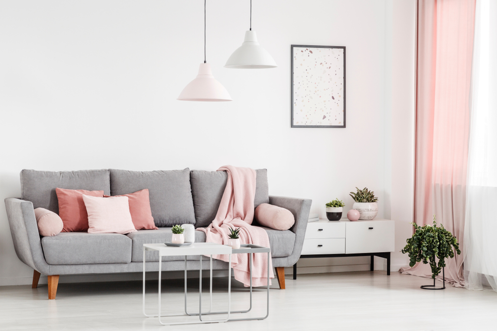
Then there’s the opposite extreme: minimalist beige and earth tones. These palettes signal calm, intentionality, and sometimes, yes, a bit of quiet luxury posturing. But they also work on a psychological level, offering stability and softness in uncertain times.
Every Outfit is a Mood Board
Ultimately, fashion is wearable psychology. Whether you’re putting on a crimson blazer for confidence, a pastel sweater for comfort, or a head-to-toe black look for armor, you’re curating not just an image, but a mood. The beauty is that it’s reversible – you can dress to reflect how you already feel, or you can dress to shift yourself into the state of mind you want to embody.
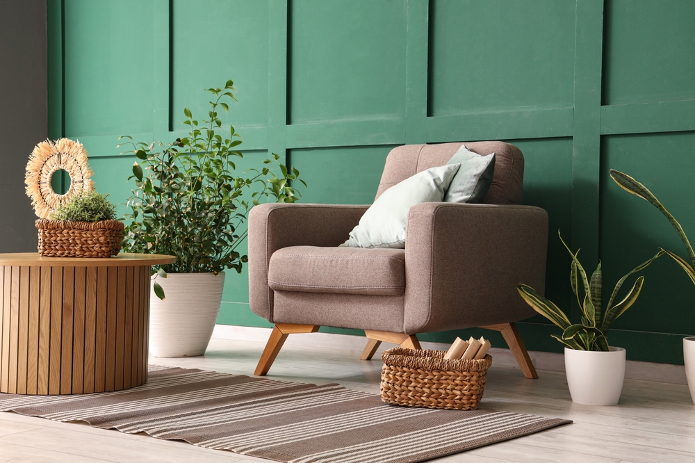
Painting the Mood: Color in Interior Design
Rooms That Whisper (or Shout)
Walk into a soft blue bedroom and you instantly feel like taking a deep breath. Step into a bright red dining room, and suddenly dinner feels urgent, maybe even loud. Interior designers know this instinctively: the colors on your walls aren’t just decoration, they’re emotional stage directions. Your living room says, “Relax.” Your office says, “Focus.” Your kitchen might say, “Eat more snacks.”
The Calm of Cool Tones
Blues and greens are the classics for creating restful spaces. Hospitals, schools, and spas have leaned on these shades for decades because they reduce stress and encourage calm. A pale blue bedroom isn’t just pretty, it lowers your heart rate and improves sleep quality. It’s essentially the paint equivalent of chamomile tea.
Warm Colors, Warm Feelings
Then there are warm tones – reds, oranges, yellows – that inject energy and sociability. That’s why so many restaurants use them: they stimulate appetite and conversation. A deep orange dining nook feels lively and welcoming, while a bright yellow kitchen can energize your mornings (though best kept in moderation, unless you want breakfast with a side of nerves).
The Minimalist Neutral Obsession
Of course, the 2010s gave us the era of neutral interiors: beige walls, grey sofas, white kitchens. Critics joked that every home looked like an Apple Store, but psychologically, these palettes served a purpose. They created calm, order, and a sense of control in chaotic times. Neutrals are quiet, reliable, and not screaming for attention.
Maximalism Makes a Comeback
Lately, though, maximalism has been sneaking back in. Bold wallpapers, jewel tones, and color-drenched rooms are trending again, a reaction to years of pared-back minimalism. After spending so much time at home during lockdowns, people craved spaces that sparked joy rather than just looking tidy on Instagram. Enter velvet emerald sofas, sunny yellow walls, and rainbow-tiled bathrooms. It’s mood enhancement, but turned all the way up.
Designing for Wellness
It’s not just about looks, it’s about mental health. Architects and designers increasingly use “biophilic design,” incorporating natural greens, earthy tones, and plenty of light to mimic the calming effect of nature. Meanwhile, workplaces have swapped cubicle-grey walls for brighter, more varied palettes shown to boost creativity and focus. Your surroundings can literally help you work smarter or nap better.
Your Home, Your Palette
The takeaway? Color is one of the cheapest, fastest ways to hack your environment. A coat of paint can shift a room’s entire emotional temperature. Whether you want calm, focus, or fun, your walls are quietly negotiating with your nervous system every day.
Branding, Marketing & the Color Economy
The Billion-Dollar Palette
If fashion and interiors are personal, branding is global. Companies don’t just choose colors – they weaponize them. Every logo, storefront, and product package is designed to trigger an emotional response before you even think about reaching for your wallet. It’s not subtle: the right shade can literally mean billions in revenue.
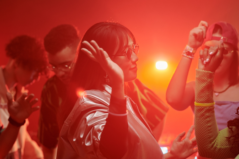
Red: The Urgency Magnet
Red’s alertness spiking hue literally makes you act faster. Coca-Cola owns one of the world’s most recognizable reds, Target and Netflix built entire brand identities on it. It’s not just eye-catching; it’s a psychological call-to-action.
Blue: The Trust Builder
Banks, tech companies, and healthcare providers have embraced blue because it conveys safety and trust. Think Chase, IBM, Facebook, Pfizer. Even when Facebook rebranded to Meta, the blue stuck around. Blue says, “Don’t worry, we’ve got you”, which is exactly what you want to hear when you’re handing over your money or your data.
Green: Eco, Calm, and Cash
Green does triple duty: it signals nature, balance, and increasingly, sustainability. Whole Foods wrapped itself in it. Spotify uses it to blend energy with creativity. In finance, green also screams money. That duality makes it one of the most versatile branding shades, it’s earthy and aspirational all at once.
Yellow: Attention, With a Smile
Yellow is the friendliest member of the palette. Think McDonald’s golden arches or IKEA’s cheerful signage. It’s playful, optimistic, and highly visible. But brands also know its limits: too much yellow can overwhelm, so it’s often used as an accent rather than the main act.
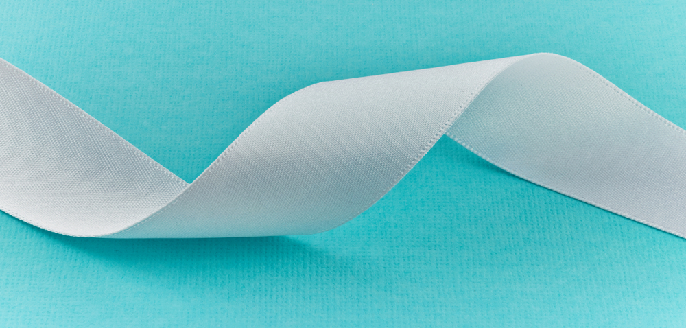
The Case of Tiffany Blue
Some companies go beyond psychology and essentially own a color. Tiffany & Co. trademarked its robin’s-egg blue so thoroughly that the shade itself became shorthand for luxury romance. You don’t even need to see the logo; one glimpse of that little box and your brain fills in the rest. That’s color as currency.
The Influencer Palette
And it’s not just corporations. Influencers and personal brands now use signature colors to build recognition. Think of YouTubers with consistent pastel backgrounds, wellness brands that bathe everything in sage and cream, or creators who curate entire grids in moody browns. It’s the digital-age version of a logo. If you scroll and instantly know whose post it is before you see their name, that’s color branding working overtime.
Why It Works on Your Brain (and Wallet)
Studies show up to 90% of snap judgments about products can be based on color alone. That means your decision to buy, or not buy, often happens before you’ve even read a word of copy. Brands know this. Supermarkets arrange packaging for maximum palette impact, apps design icons to stand out against your home screen, and fast-food chains calibrate interior colors to increase turnover.
From Advertising to Atmosphere
Even beyond logos and packaging, entire spaces are color-engineered. Fast-food chains lean on reds and yellows to speed up eating. High-end boutiques use dimmer, warmer palettes to slow you down and make you linger (and spend more). Casinos play with deep reds and golds to energize without feeling chaotic. Your environment is being tuned, down to the hex code.
The Physical Side of Color
Colors to Set the Pulse Racing
Color doesn’t just play tricks on your mood, it tinkers with your body, too. Red, for example, has been shown to raise heart rate and blood pressure, which might explain why it feels energizing (or agitating) in large doses. Blue, on the other hand, can slow breathing and lower pulse, which is why hospitals, spas, and wellness apps lean on it like a visual sedative. These responses have deep evolutionary roots, with colors in nature triggering certain reactions from predators and prey alike.
Triggering a Physical Response
Researchers have even found that color can shift our perception of temperature. Rooms painted in warm hues like orange or red are often described as feeling hotter than they really are, while cool-toned spaces are perceived as physically cooler. Appetite follows a similar pattern: red and yellow encourage eating (hello, fast food chains), whereas blue suppresses it, a fun fact to remember if you’re ever designing a diet-friendly kitchen.
So the next time you feel “off” in a room, it might not be the people, it might be the paint.
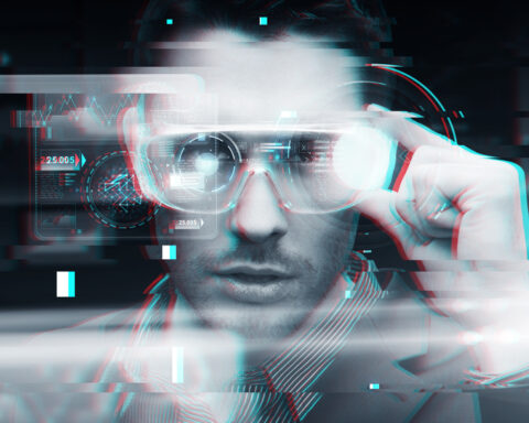
Where Color is Headed Next
Smart Light, Smarter Mood
If color has been shaping moods and bodies for centuries, the next step is using it deliberately, and tech is already on it. Smart lighting systems can now adjust hue and brightness to match your circadian rhythm, bathing you in energizing cool light in the morning and calming warm tones at night. Think of it as personalized sunlight on demand.
Virtual Reality Gets a Color Upgrade
In healthcare, researchers are experimenting with chromotherapy environments in virtual reality: immersing patients in calming blue or green fields to reduce stress, ease pain, or support meditation. Meanwhile, workplace design is flirting with AI-driven palettes that adapt to task (deep focus, collaboration, or relaxation) all cued by shifting color schemes.
The Changing Colors of Fashion (Literally)
And then there’s fashion and interiors moving toward color as interactive. Designers are playing with materials that change hue based on light, temperature, or even mood data pulled from wearables. Imagine a jacket that turns calming lavender when your stress spikes, or a home office wall that subtly shifts to green during long Zoom calls.
In short, the future of color is less about choosing it and more about programming it. Soon, your surroundings won’t just look good, they’ll be tuned to keep you feeling good.
We tend to think of color as background noise – paint on the walls, fabric in the wardrobe, logos on the shelves. But look closer and it’s clear: color is an active player in our lives, shaping emotions, nudging decisions, and even shifting our biology. From the calm of a blue bedroom to the appetite trigger of a red restaurant, from Tiffany’s luxury turquoise to Barbie’s unapologetic pink takeover, color is a constant (if quiet) influencer.
What’s striking is how instinctive it all feels. You don’t stand in your green kitchen thinking, “Ah yes, balance and renewal.” You just breathe easier. You don’t buy the Tiffany box because you analyzed its Pantone number, you buy it because the color itself makes your heart skip. It’s unconscious, but it’s powerful.
And as technology evolves, we’re moving from passively reacting to color to actively programming it. Smart lights, responsive materials, VR environments – these aren’t just design gimmicks, they’re mood tools. The future might look like a personalized palette tuned to your circadian rhythm, your stress levels, or even your calendar.
So, next time you choose a shirt, a sofa, or a phone case, remember: you’re not just picking what looks nice. You’re curating how you want to feel, and maybe how you want the world to feel about you.
Life, it turns out, isn’t black and white. It’s mood-altering technicolor.